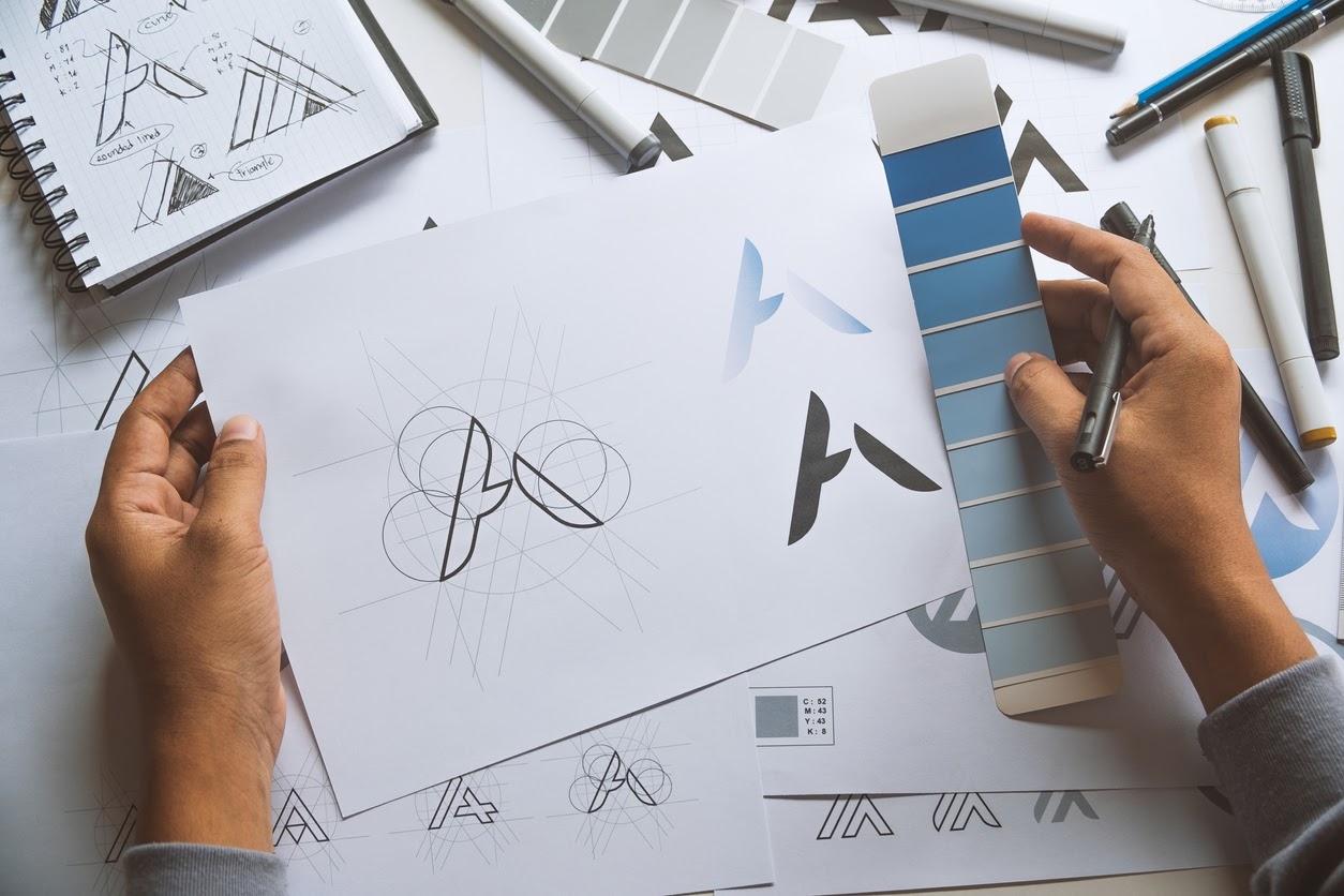
Not everyone has the budget to hire a graphic artist to create an amazing logo that tells the story of their business in a single photo. Many programs exist that help you put together an eye-catching logo all by yourself. They often use templates to get you started, but others prompt you with questions and produce options based upon your responses.
You won’t end up with a perfectly original logo, in the sense that yours will be completely unique and unlike any other, but you will have one that looks different enough from other businesses in your area to be distinguishable and new. It will also give customers a representation of your company’s personality.
No program can do it all for you though. First, you need to understand and apply a few important concepts before you attempt a create your own logo design. You’ll need to know what makes a good, eye catching graphic and how to use it to your advantage.
Simple in Design
The ideal logo provides a simple, distinctive representation of a business. Unlike an infographic that thrives on complexity, a logo communicates in a direct, straightforward way. Skip the complicated design and choose the simple. The Coca-Cola logo simply states the company name in a memorable script. The double arches of McDonald’s provide a single letter that stands for the company. Throughout the world, people recognize these and other logos which communicate the company and its reputation through a graphic.
Memorable and Unique
Great logos like the Motel 6 graphic also communicate the company personality and name in a unique manner. From IBM to 3M, no other logo looks like that company. It might come from the font you use or the line graphic, but something about your logo stands out without looking too busy or complex. Use a clear, easy-to-read font that stands out.
Scale and Versatility
This all-important graphic also needs to be versatile in nature. It must scale for use on multiple types of collateral. You should be able to use it on business cards, t-shirts, folders, signage, etc. without losing clarity. The graphic needs to scale easily so it looks just as great when tiny as it does three feet tall.
Timeless and Effective
Like the Coke and Pepsi logos, your logo design should stand the test of time. You should not need to re-design it every few years. When you put it together, the amalgamation of lines, words, letters, color, and ideas should accurately communicate your company for years to come.
Color Theory
It may sound funny to a non-designer, but color communicates meaning. Think how you feel more confident wearing red or more serene wearing blue. This effect takes hold with logo designs as well. The colors you use communicate with your audience are just as important as the image itself. People draw assumptions about your business based upon your logo’s colors. Here are a few colors and and responses to clarify what we mean:
- Blue: communicates security, strength, cleanliness and dependability.
- Green: communicates wealth, nature, and relaxation.
- Red: communicates urgency, commands attention and increases appetite.
- Orange: communicates vitality and energy.
- Yellow: communicates warmth, friendliness and youth.
- Black: communicates luxury, power and competence.
- Purple: communicates calm, playfulness, imagination and relaxation.
Restaurants frequently use red and orange, since both of these colors communicate appetite increase. If you see red or orange, you will get hungrier. Think about McDonald’s design again. Its simple M arches communicate using the colors yellow and red. You think of warmth, comfort food, and a friendly atmosphere.
Many consulting businesses use red and black in their logo design to communicate power and confidence. Businesses pay them to help them research and make better business decisions, so from the outset – their business card and its logo design – they want to communicate their strength and knowledge.
Learning Before Doing
Most of the DIY programs do not explain color theory nor the need for an uncomplicated design. They just prompt you for colors, shape, font, etc. You need to understand these things before you attempt to design your logo to help you optimize your graphics effectiveness.
Conclusion
The best way to learn what makes a good logo is to look at a bunch of them. Study each logo. Determine what each says to you. Does that mesh with the actual company? Grab a few print magazines and look at the ads: each ad should have the company logo somewhere in it. Was it hard to find or notice the logo in the ad? Learn from the mistakes and successes of other logos and designs, and try to gain inspiration for your own.
No one expects a DIY-er to come up with the next Coca-Cola graphic. A logo so universally recognised took the efforts of many advertising experts. You, however, should be able to communicate to your audience what your company stands for graphically.
To Get Started
Write down a few words on a sheet of paper that describe your business. Think in terms of brainy, powerful, energetic, determined, educational, etc. Describe it in single simple words.
Start experimenting with Color Theory. Match your words to one or two colors from the list. Those are the colors that belong in your graphic. Next, choose your font. Decide how you will divide your business name or if you will. Does it require three lines? Can you fit it onto one line as Coke did?
Anyone can DIY their logo design. With a bit of creativity and research, the design you choose for your company can stand out without being a hassle to create.
If this seems complex and you want help, contact Bake More Pies! We’re here for you and we will happily help you design something that fits your specific needs.


