Colors are more than just visual elements—they have the power to influence emotions, perceptions, and decisions. In digital marketing, color psychology can help you create campaigns that resonate with your audience, shaping your brand’s image and drive sales. Blues inspire trust, and bold reds evoke excitement. This guide will explore using colors in digital marketing and how they will impact your audience.
The Importance of Color in Marketing
Color is more than an aesthetic element. It shapes consumer views and influences buying decisions. Color is a powerful tool in digital marketing. It can evoke emotions, convey brand identity, and guide customer behavior. Marketers can use color to connect with their audience to inspire desired actions.
Emotional Associations with Color
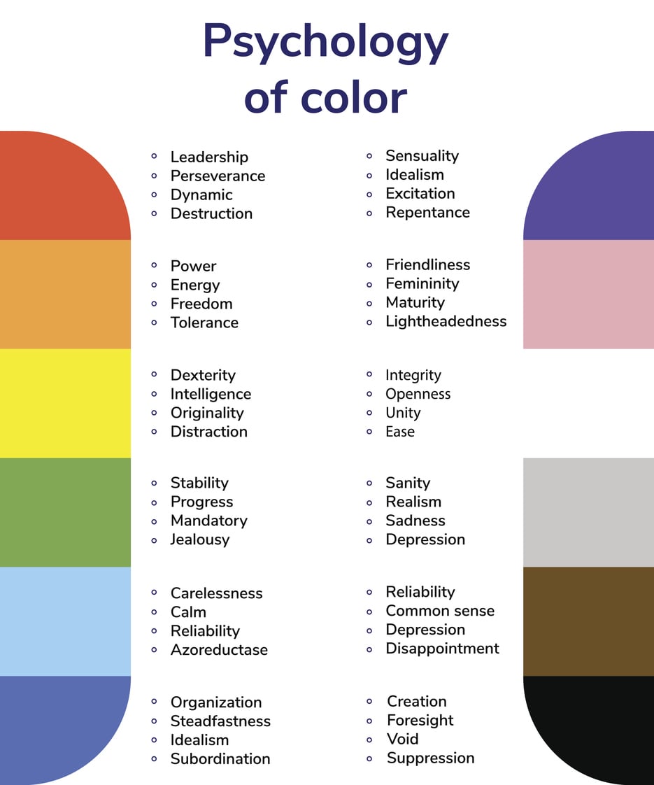
Colors have emotional meanings that can change depending on the culture and situation. Marketers can use these emotional connections to pick colors that appeal to their audience. Choosing the right colors can help the brand’s message stand out and create a stronger bond with the audience. Consider the following color associations:
- Red: Often associated with excitement, urgency, and passion. It can boost appetite and spur impulsive buying, so it’s a popular choice for call-to-action buttons.
- Blue: Evokes feelings of trust, calmness, and reliability. Financial institutions frequently use it to instill a sense of security.
- Green: Symbolizes nature, health, and tranquility, making it a favorite among brands that promote organic or eco-friendly products.
- Yellow: Conveys optimism, warmth, and energy. It’s often used to grab attention or evoke feelings of happiness, making it a common choice for clearance sales and promotional banners.
- Purple: Associated with luxury, creativity, and wisdom. It’s often used by brands to convey sophistication or a sense of exclusivity.
Color in Brand Identity
Color significantly contributes to brand identity and recognition. Consistent use of color in branding helps establish a cohesive visual language that consumers can easily identify. Consider the following brands:
- Coca-Cola: Utilizes a vibrant red to convey energy and excitement, creating a strong emotional connection with its audience.
- Whole Foods: It uses green to show freshness and health. This aligns with its values of sustainability and quality.
- Facebook: Uses blue to communicate trust, dependability, and a calming sense of connection, aligning with its mission to bring people together.
- McDonald’s: Uses red and yellow to spark energy and hunger. It creates a fast, happy dining experience.
- Cadbury: Uses purple to signify luxury, boosting its premium chocolate brand.
The Psychological Impact of Color on Consumer Behavior
The psychology of color extends beyond mere aesthetics; it proudly influences consumer behavior. Color perception is subjective. It can be influenced by many factors, such as personal experiences, culture, and gender. For instance, studies show men and women may prefer different colors. This can affect their responses to marketing materials. Marketers should consider these nuances when designing campaigns. Their color choices must resonate with their target demographic.
Consumers often judge products within 90 seconds of seeing them. Color plays a major role in these decisions. Color can account for a significant portion of the information that shapes first impressions. It is vital to choose colors that match your brand’s message and evoke the right emotions in your audience.
Regional Color Associations
When marketing globally, it’s vital to understand cultural differences in color perception. Regional color associations greatly influence how audiences interpret and react to marketing messages. In North America, yellow means cheerfulness and optimism. In some Asian cultures, it symbolizes courage and royalty. Similarly, in Western cultures, purple means luxury and creativity. In some Eastern cultures, it is linked to mourning. These variations show that cultural views of color matter in marketing.
Color Combinations and Their Effects
The way colors interact with one another can also influence consumer perception. Effective color combinations can enhance visual appeal and drive engagement.
Using contrasting colors can help highlight important elements within marketing materials. A dark background with light text can improve readability and draw attention to key messages. This principle is often used in website design. Contrasting colors can direct users’ eyes to important information and call-to-action buttons.
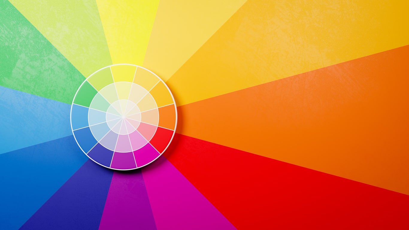
Complementary colors are opposite each other on the color wheel. They can create a pleasing balance. Used well, complementary colors can improve a brand’s look and make important elements stand out.
Practical Applications of Color Psychology in Digital Marketing
Marketers can harness the power of color psychology to create more impactful and engaging digital campaigns. Here are some applications:
- Website Design: Use colors to guide navigation, highlight calls to action, and evoke emotions that match your brand.
- Social Media Posts: Use color schemes that match each campaign’s mood. This will boost engagement and brand recognition.
- Email Marketing: Use eye-catching colors for buttons and headers in your emails. They should encourage clicks and actions.
- Online Advertising: Use bold, contrasting colors to grab attention. Quickly convey your message to potential customers.
- Branding and Logo Design: Create a color palette for your brand and logo. It must reflect your values and appeal to your audience.
Contact Us
Color psychology is a powerful way to connect with your audience on a deeper level. The right colors can reflect your brand’s values, build trust, and inspire action—leading to better engagement and higher conversions.
At Bake More Pies, we design custom digital marketing strategies that make your brand stand out. By using color psychology, we help you create campaigns that are both visually striking and highly effective. Let’s work together to bring your marketing to life. Contact us today!


